April 27, 2024
Vittorio Gioda
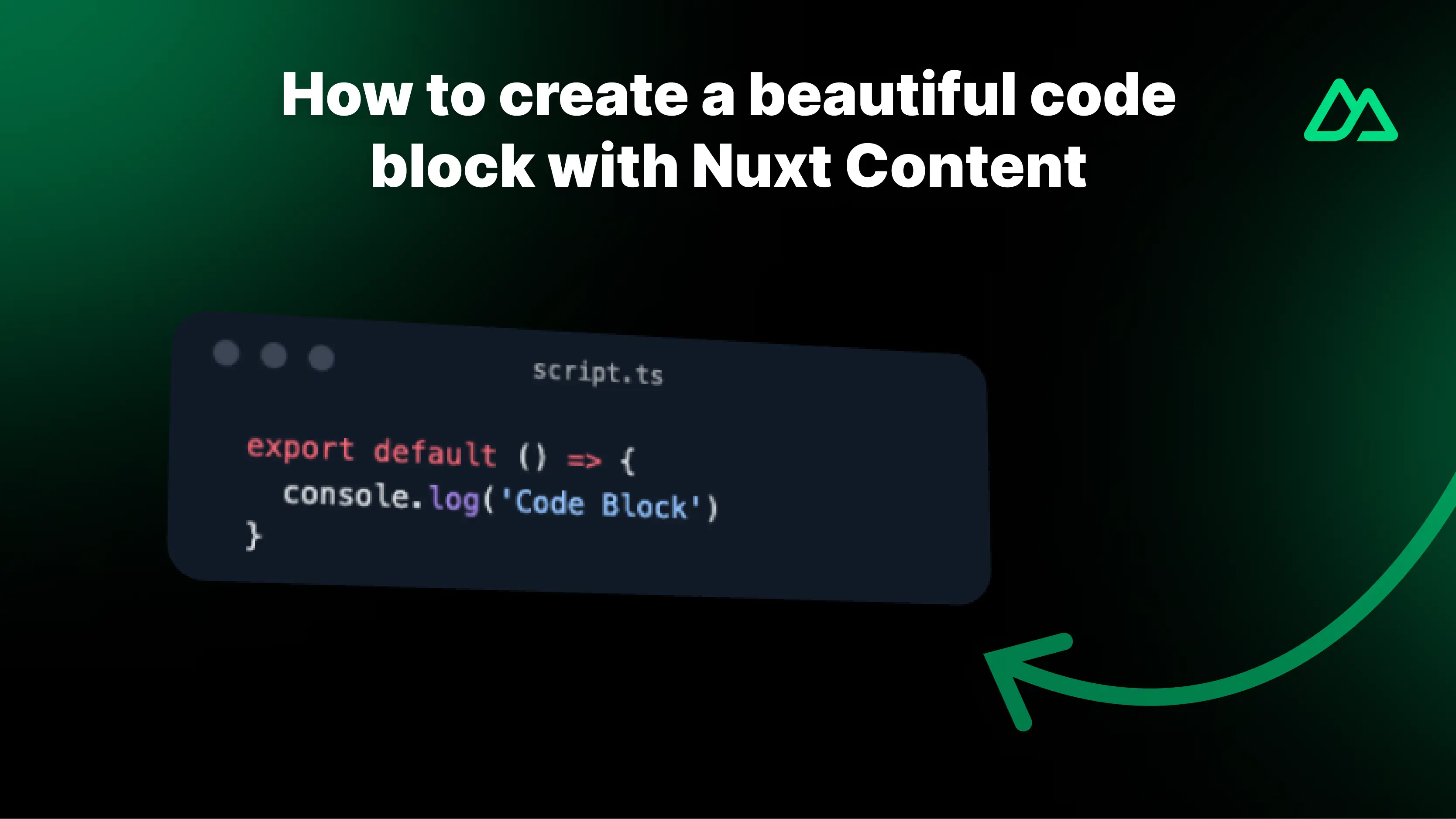
How to Create a Professional Code Block for Nuxt Content
A guide to creating a custom ProsePre component for your NuxtContent project.
In this simple guide, you will find 4 steps to create a customized ProsePre component for your project using NuxtContent.
1. Install Packages
To create a custom ProsePre component, you need to install some packages. In this case, we will use VueUse to enable users to copy the code, Lucide Vue Icon for the icon, and the Nuxt Color Mode module for dark mode functionality.
If you want to save time, you can install all packages with this command:
pnpm i @vueuse/core lucide-vue-next @nuxtjs/color-mode
2. Configure Theme
Now that you've installed the packages, you need to configure the theme for your project. To do this, open the nuxt.config.js file and add the following code:
export default defineNuxtConfig({
  modules: [
    // ...
    '@nuxtjs/color-mode',
    '@nuxt/content',
  ],

  content: {
    highlight: {
      theme: {
        default: 'light-plus',
        dark: 'github-dark',
      },
    },
  },
  // ...
})
Nuxt content uses Shiki for code syntax highlighting. Shiki supports various themes, so you can choose your preferred one from this list: https://shiki.style/themes.
As you can see, we use one option for default and one for the dark theme because the content highlighting configuration is compatible with the Nuxt Color Mode module you just installed.
3. Create the Component
Based on Nuxt Content directives, you need to create a new file to override the original ProsePre component.
First, create a components folder in the root of your project, and within it, a content folder. In this folder, create a new Vue file named ProsePre.vue:
components/content/ProsePre.vue
Now write the component code as follows:
<script setup lang="ts">
import { useClipboard } from '@vueuse/core'
import { Copy } from 'lucide-vue-next'

// component props
defineProps({
  code: {
    type: String,
    default: '',
  },
  filename: {
    type: String,
    default: null,
  },
  class: {
    type: String,
    default: null,
  },
})

// component hooks for clipboard
const { copy, copied } = useClipboard()

// timer for copied message
const showCopiedMessage = ref(false)
onMounted(() => {
  if (copied) {
    showCopiedMessage.value = true
    setTimeout(() => {
      showCopiedMessage.value = false
    }, 3000)
  }
})
</script>

<template>
  <div>
    <div class="dark:bg-[#1F2937] border shadow-lg bg-neutral-200 my-5 rounded-md pt-3 px-5 group">
      <div class="flex sm:grid sm:grid-cols-3 mb-3 justify-between items-center">
        <!-- the three colored dots mac style -->
        <div class="hidden sm:flex gap-2.5">
          <div class="size-3 rounded-full bg-[#FE5F57] hidden group-hover:block" />
          <div class="size-3 rounded-full bg-[#FEBC2E] hidden group-hover:block" />
          <div class="size-3 rounded-full bg-[#28C840] hidden group-hover:block" />
          <div class="size-3 rounded-full dark:bg-gray-600 bg-neutral-400 group-hover:hidden" />
          <div class="size-3 rounded-full dark:bg-gray-600 bg-neutral-400 group-hover:hidden" />
          <div class="size-3 rounded-full dark:bg-gray-600 bg-neutral-400 group-hover:hidden" />
        </div>
        <!-- filename -->
        <div class="border-b font-mono text-xs text-center dark:text-white/60 max-sm:truncate">
          {{ filename }}
        </div>
        <!-- copy button -->
        <div class="flex justify-end">
          <Copy v-if="!copied" class="cursor-pointer opacity-50" :size="16" @click="copy(code)" />
          <div v-else class="text-xs opacity-50">
            Copied!
          </div>
        </div>
      </div>
      <!-- code block -->
      <pre class="my-0 font-[500] bg-transparent leading-normal font-mono" :class="$props.class"><slot /></pre>
    </div>
  </div>
</template>

<style>
pre code .line {
  display: block;
}
</style>
This component contains the necessary code to create a professional code block. You can further customize it according to your needs.
4. Render the Component
Done! Now you can use your new ProsePre component in all your articles following Nuxt Content directives. (If you're unsure how, check the official documentation).
Remember to specify the language used and the file name within your component:
```ts [file.ts]
  export default () => {
    console.log('Hello, World!')
  }
// your code here and close the code block
5. Conclusion
Now you have a custom ProsePre component for your Nuxt Content project. You can further customize it to suit your needs and make it unique.
The possibilities are endless, so have fun creating your component!
If you have any further questions, feel free to reach out to me via social media (you'll find the buttons at the bottom of the page).
Happy coding! 👨💻